Colour trends in fashion for 2026: How to wear the season’s boldest hues for your skin tone
We’ve been living in a beige-tinted purgatory for long enough. While Quiet Luxury offered our retinas a pleasant nap, 2026 has officially walked into the room, flicked on the stadium lights, and demanded we start feeling things again. The runways are now a riot of high-voltage neons, deep forest hues, and ethereal whites that look as though they’ve been lifted straight out of a digital dreamscape.
But here’s the catch glossy magazines often skip in their rush to sell a “must-have”: a colour trend only works if it doesn’t make you look like you’ve spent the week battling a vicious flu. The real secret to wearing the 2026 palette lies in one word—seasonality.
Colour trends for 2026
1. Chartreuse
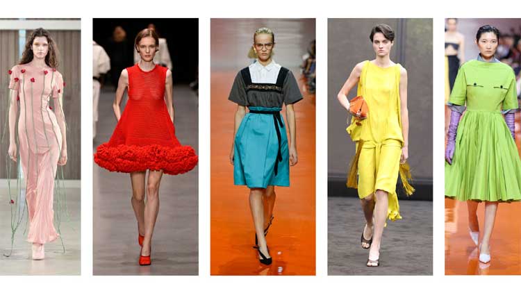
If 2026 had a pulse, it would be Chartreuse. Sharp, caffeinated, and unapologetic, it’s a confident evolution from the “Brat Green” era of recent years. That said, Chartreuse is a notoriously picky guest. On spring and winter palettes, it works like a cinematic ring light, sharpening features and boosting clarity. On others, it can veer dangerously close to radioactive.
2. Canary Yellow
Canary Yellow is the undisputed main-character colour of the season. Think liquid sunshine—but with conditions. It thrives on the warmth and energy of spring colouring. On cool-toned summers, however, the shade tends to dominate rather than flatter. This is a colour that needs natural zest already present in your skin tone.
3. Cobalt Blue
Cobalt Blue is the high-definition hero of 2026. Deep, saturated and commanding, it’s a superpower shade for winters, delivering crisp contrast that sharpens features and brightens the eyes. Cool summers can also lean into it—just keep fabrics matte and fluid rather than glossy to avoid overpowering softer colouring.
4. Botanical Green
For those who find neons mildly offensive, 2026 offers a soulful alternative. Botanical Green is a deep, moody forest hue that feels grounded and luxurious. It’s a dream for autumns and winters, especially in rich textures like suede, silk, or heavy knits. Think “old money,” reimagined for a nature-obsessed era.
5. Olive Green
If your colouring is muted and delicate, Olive Green is your safest bet. A utility-chic staple for autumns and springs, olive works like a neutral without ever feeling dull. With the right warm undertones, it delivers effortless sophistication and is nearly impossible to get wrong.
6. Cloud Dancer
Step aside, sterile hospital white. Cloud Dancer—the soft, ethereal off-white of 2026—is creamy rather than stark, and universally flattering across summer, spring, and autumn palettes. It suggests ease, polish, and a low-stress life well lived.
7. Candy Pink
Candy Pink is the season’s optimist. A favourite for spring and summer, it brings freshness without slipping into the aggressive Barbiecore of years past. Especially flattering on cool and neutral undertones, it works beautifully head-to-toe or as a pop against Cloud Dancer, soft greys, and powdery blues. In 2026, Candy Pink feels less trend-chasing and more quietly confident—soft, approachable, and modern without sacrificing polish.
Comments are closed.